
Aponia Pain Management Vet
Laura approached Rivelin Design in search of a rebrand to support the relaunch of her veterinary pain management business. Her aims for the relaunch were to capture the principle of Aponia or ‘freedom from pain’ that underpinned her business ethos. This meant a shift away from the overly predictable vet-style visuals, drawing more on the look of wellness brands to signal emotional support as well as clinical care. It needed to look as professional on her website and socials as it did on her own uniform when out on call.
Our interpretation of the brief resulted in an impactful monogram A with a swishing tail that seamlessly flows through the design. A soft gradient mask on the swish helps it fade into the curvature of the letters, to avoid dominating the word. The dot of the ‘I’ was replaced with a paw print, retaining a connection with animals and to keep the overall design from looking unapproachably ‘high end’.
According to Laura, Rivelin Design “understood completely when I explained the common pitfalls of logos in the industry and what I was wishing to avoid. Frankie produced a fresh, modern design that completely fits my product, on a fairly open ended brief about what a logo could look like. I’d thoroughly recommend her for her creativity, professionalism and ease of collaboration.”
Take a look at the finished designs over at aponia.vet
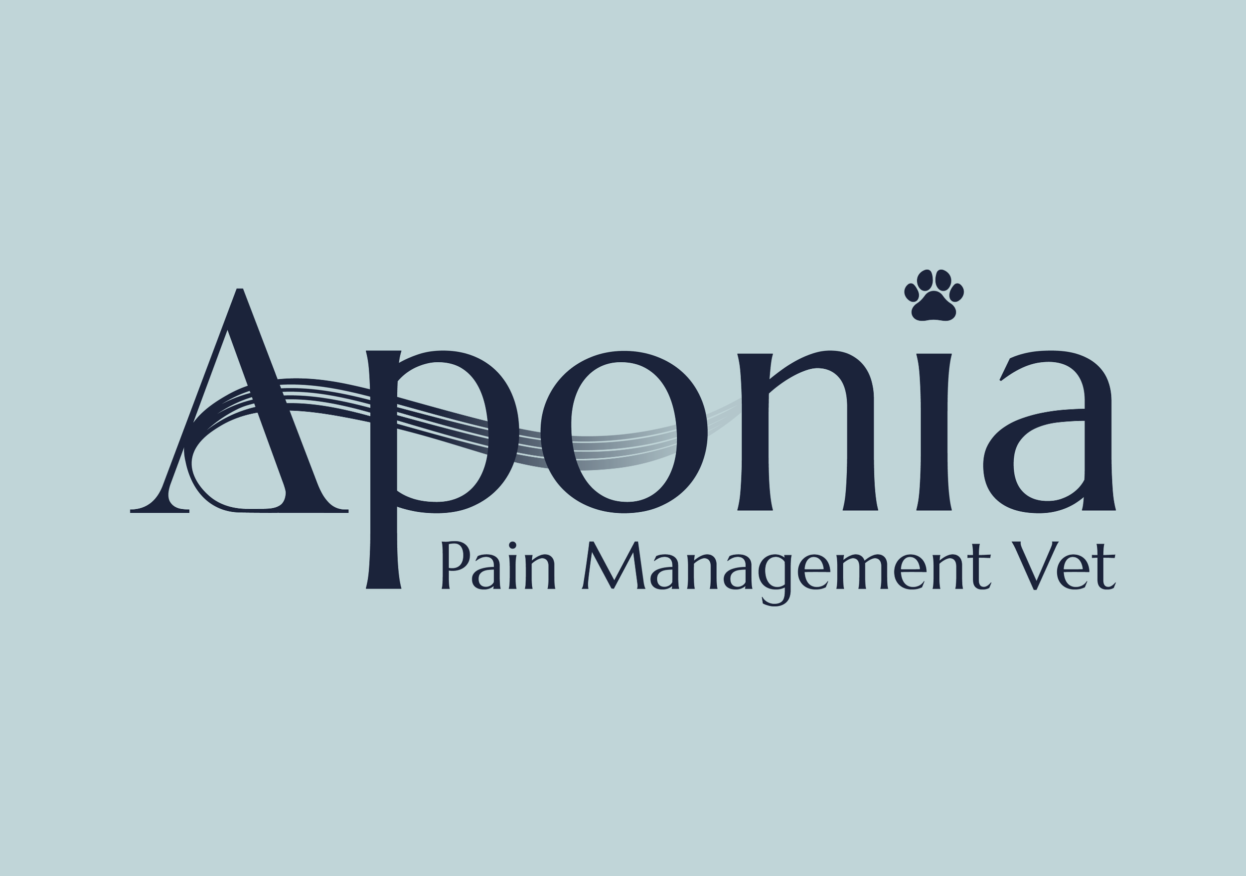
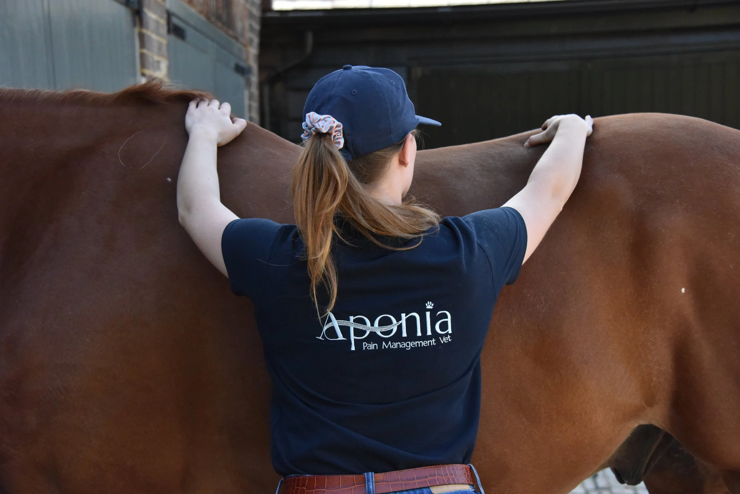
Photo Source: Laura MacDougall
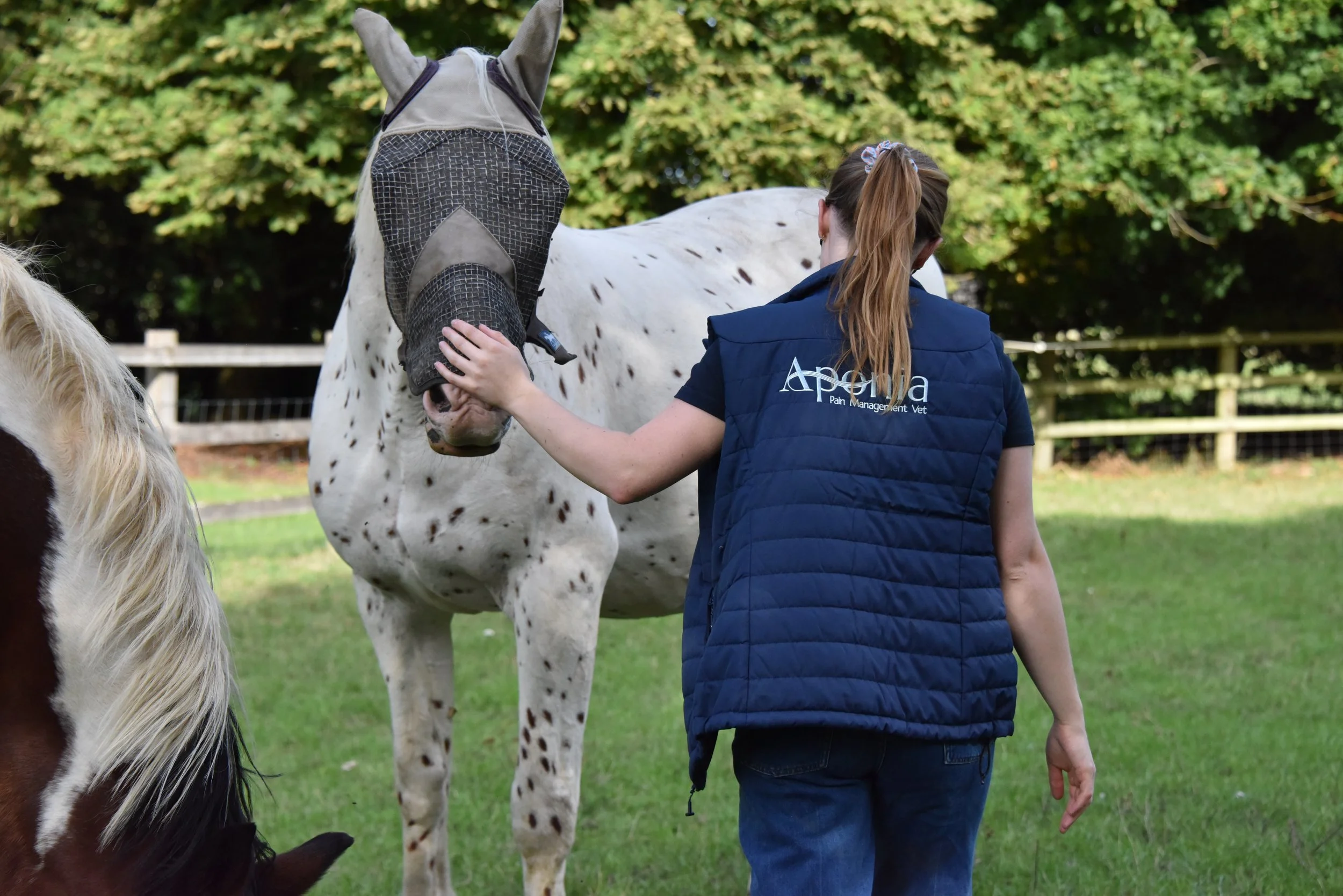
Photo Source: Laura MacDougall
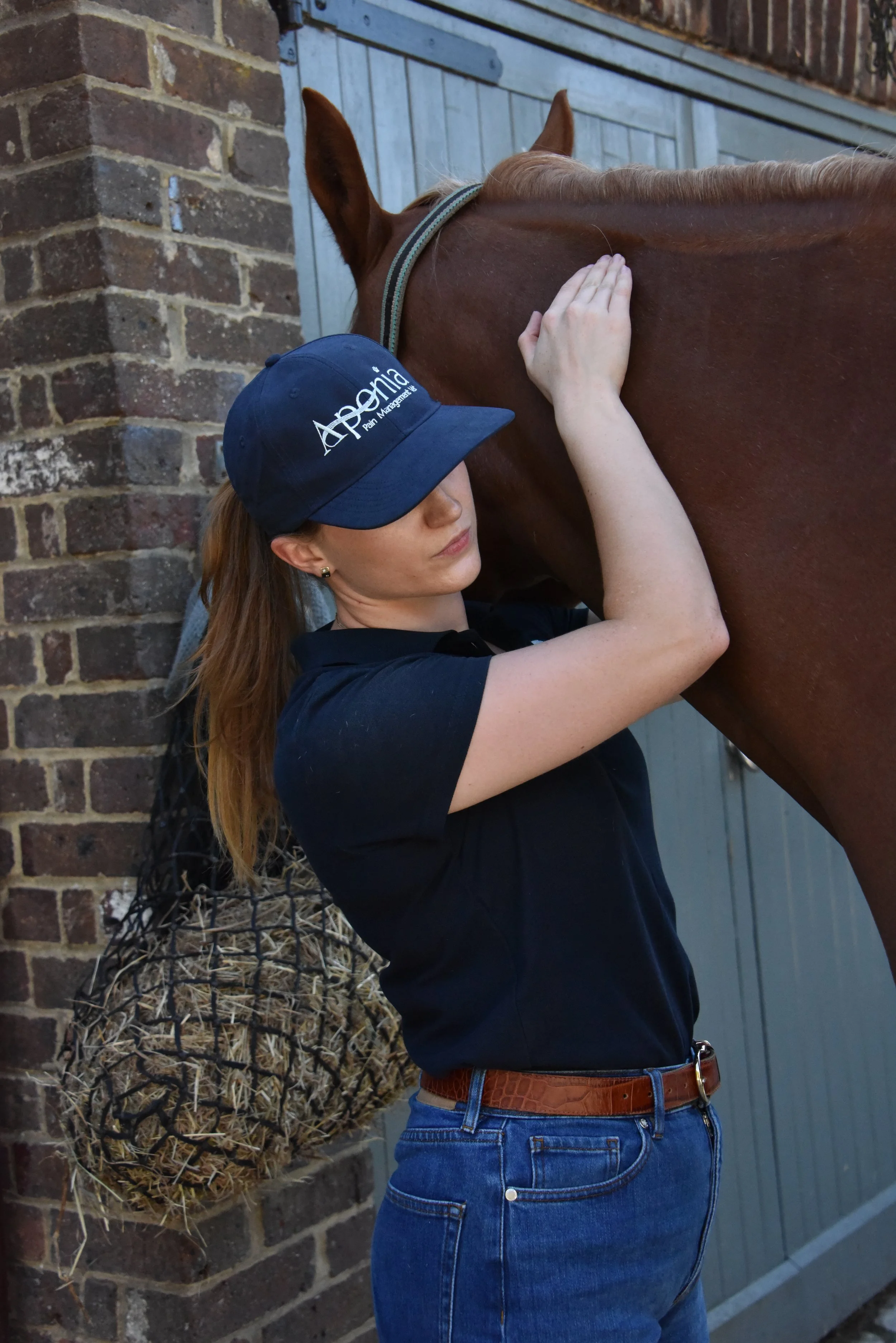
Photo Source: Laura MacDougall
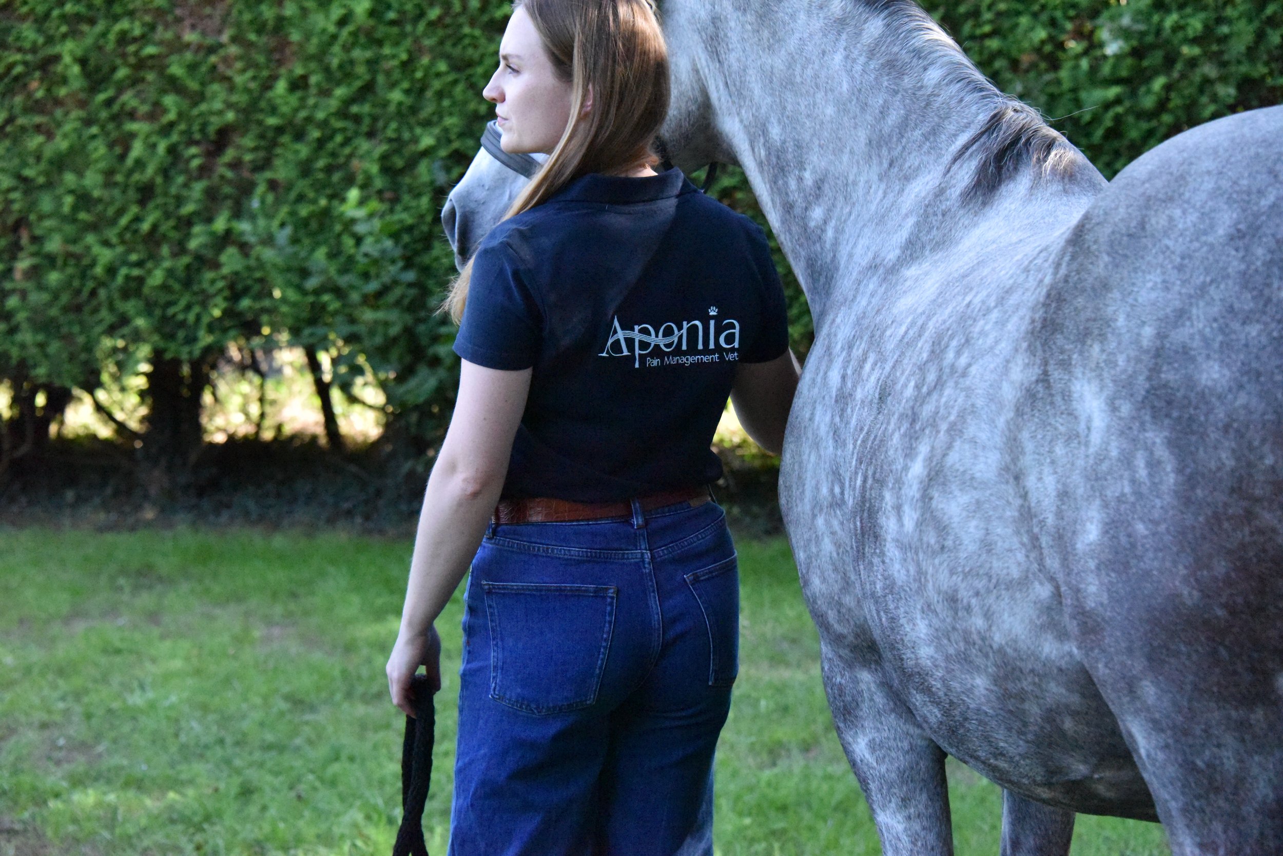
Photo Source: Laura MacDougall